GoCanvas Form Builder 3.0
DATE
November 2019 to present
MY ROLE
Lead UX Designer
OVERVIEW
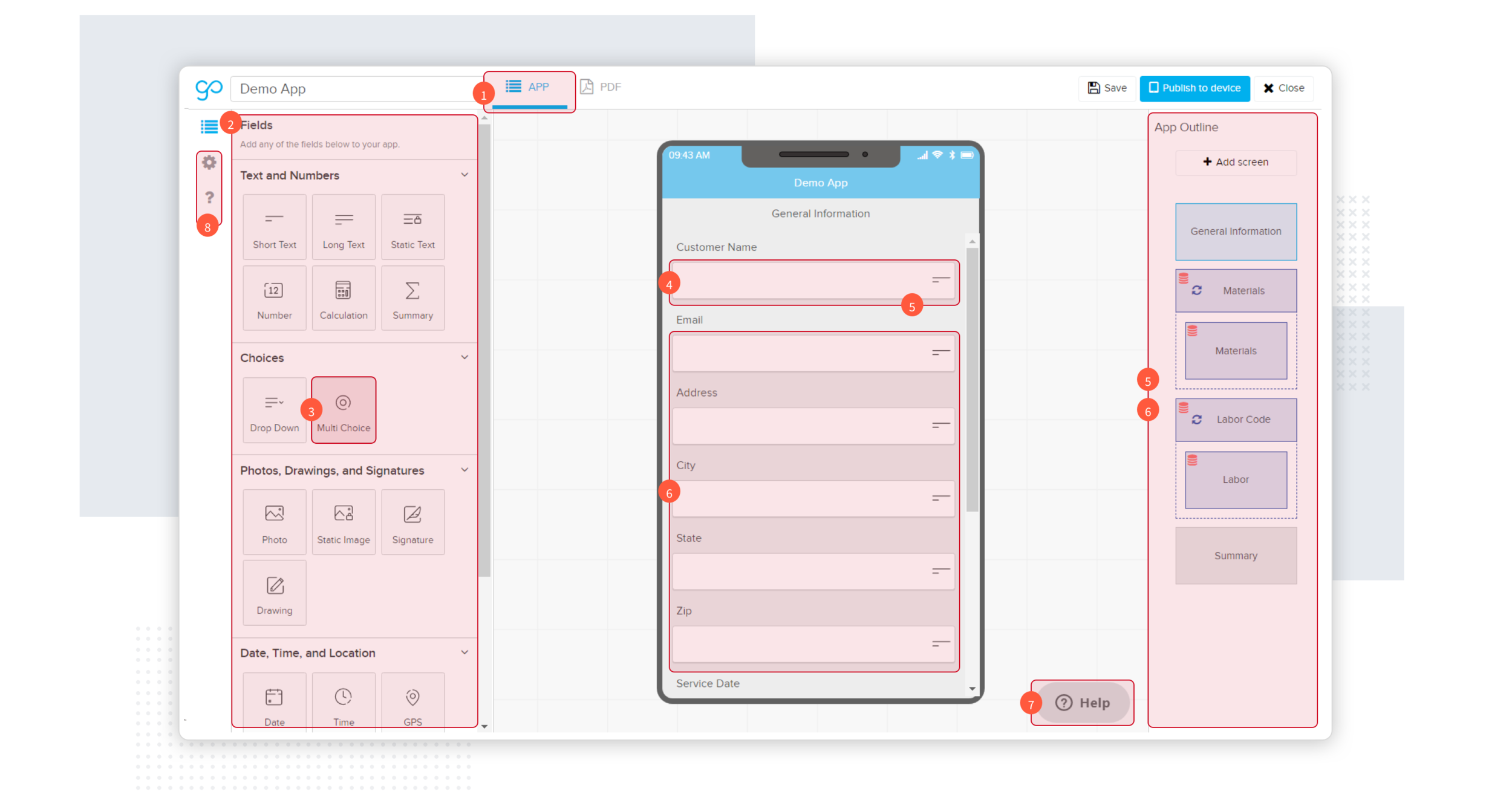
The GoCanvas Builder is a drag-and-drop tool which allows admins to create digital forms for their business. The forms then get pushed out to their workforce to be filled out on their mobile devices. The Builder is known to be powerful yet daunting for first-time users (even power users). We’ve tested the Builder in usability sessions and we know it is a point of friction for many of our users. It is also often the point at which users decide to abandon GoCanvas.
PROJECT PLAN
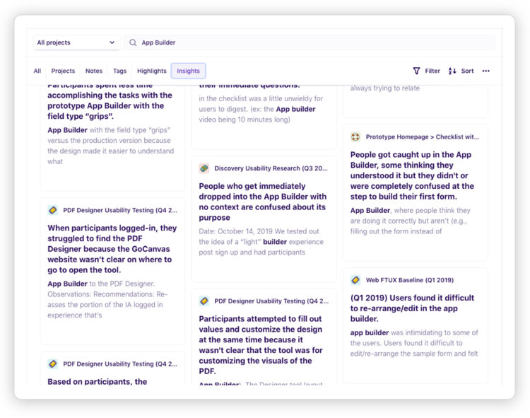
As part of the research phase, our UX Researcher was tasked with helping the team identify pain points with Builder 2.0. This was done by way of usability tests and existing research.
After diving into user research and reviewing insights from usability tests and existing/historical research, we found that the interface is hard to understand, the terminology is unclear, and there was persistent mental-model confusion (aka building a form vs. filling out a form).
EXISTING PAIN POINTS
Our research highlighted pain points we knew existed but also surfaced pain points in our blind spot.
Common pain points discovered:
01 Customers struggled with understanding the concept of a digital form being called an App within GoCanvas. This is an internal company battle we’ve battled due to internal politicss so this was not a surprise.
02 Customers referred to the tool used to build a form as “Form Builder” rather than “App Builder”, “Form Designer”, or “Form Creator”.
03 Customers felt they needed to learn Builder 2.0 first before building a form. It was a trial and error experience rather than a contextual exploration.
04 Builder 2.0 lacked visual affordance causing features/abilities to be hidden and unexplorable.
05 Customers were trying to fill out a form into the workspace (the area in which you build your form) as they built their form. They struggled with understanding that they first build a form, publish it to their users, and then fill it out on mobile.
06 Customers experienced difficulty in exploring how to delete or rearrange a field, section, screen, and other attributes.
07 Customers desired context and guidance as to what they were looking at and what to do next.
08 Power users first added field types to the workspace then labeled them, whereas, non-power users added a field type, gave it a label, then repeated for additional fields.
UX DESIGN – COLLABORATION & IDEATION
We wanted to tackle the pain points we discovered during usability testing but also wanted to use this opportunity to reimagine our product offering. Could we get smarter and predict what customers were going to add to their form? Could we take the work away from the customer and do the leg work for them?
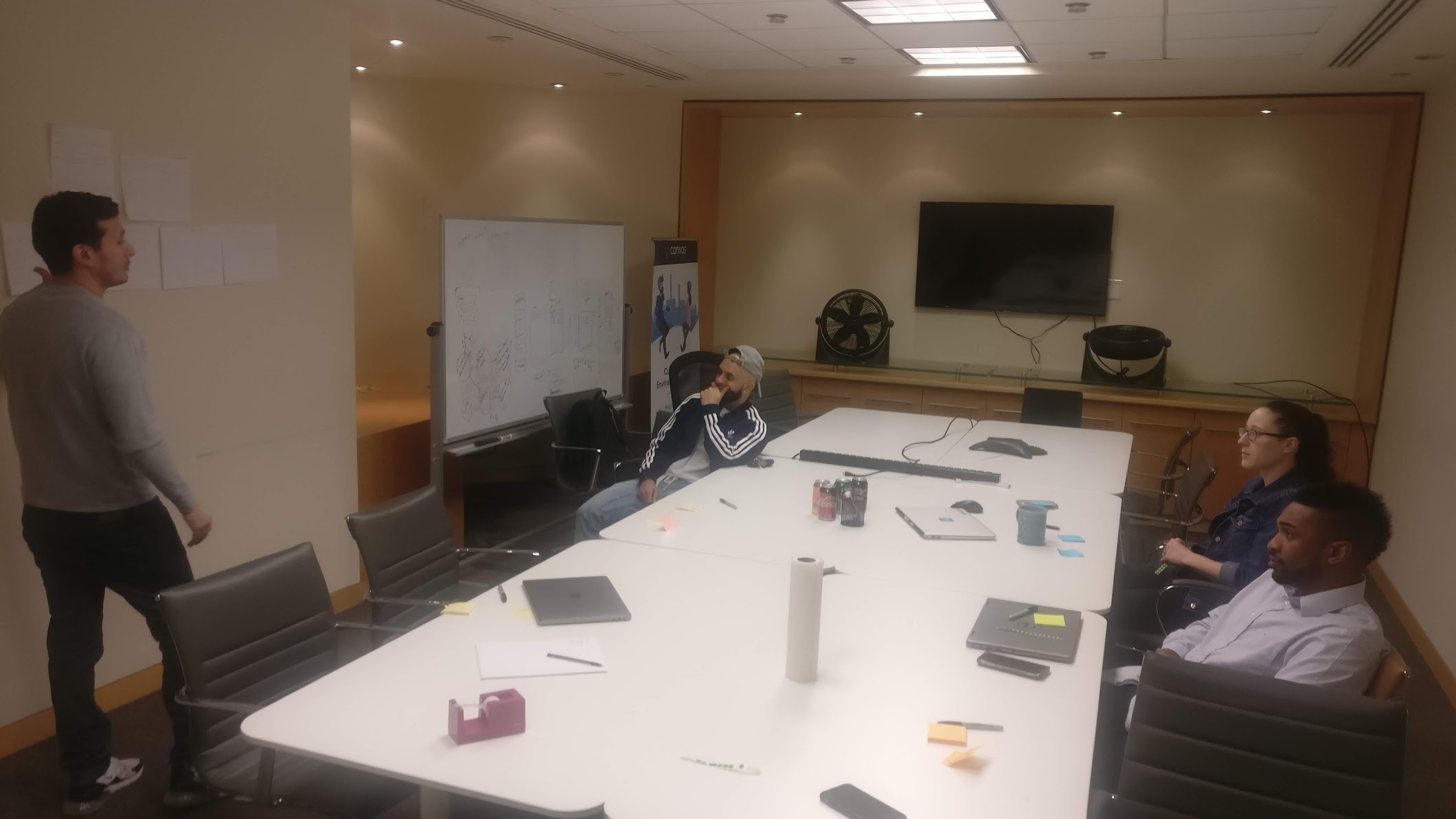
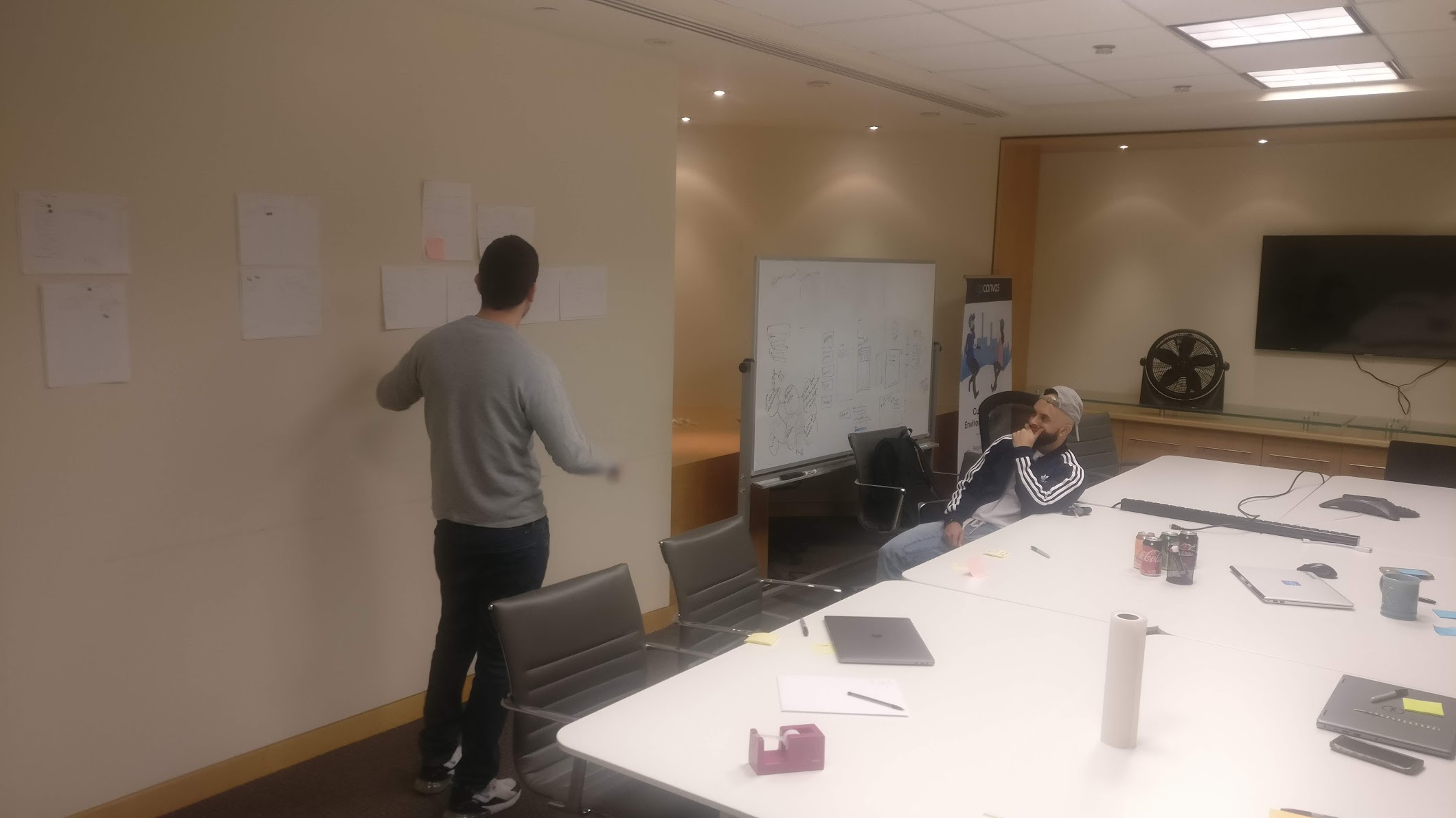
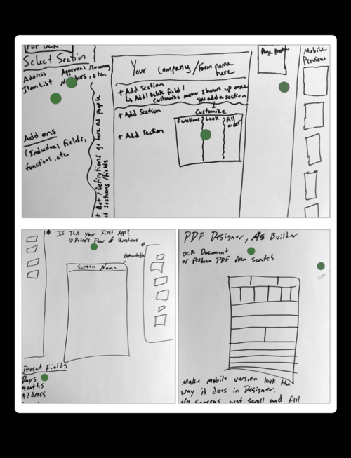
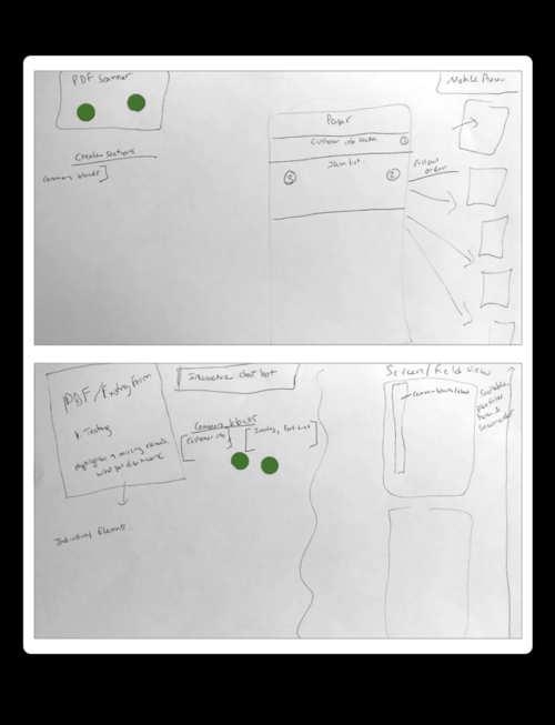
We invited internal stakeholders (those that sold the product or supported customers day-to-day) to reimagine the builder with us. We started by having each stakeholder sketch out their ideal form builder. We then had them talk the group through their ideas and rationale followed by asking other participants to vote on their top 3 ideas from each sketch.
Following this exercise, we invited the participants back the following day to design that perform form builder. By having them step away for a day, we gave them time to think up additional ideas (aka those shower thoughts we all have). The final session gave the UX team an invaluable amount of ideas we could explore as part of our solution.
SYNTHESIZE
Following all the research and ideation sessions, we synthesized our goals down to:
- Design a form builder that meets them closer to their paper process-based mental model, rather than expect the user to meet us at a fully technology-based mental model. For example, customers think of a field as the field name, not the field type.
- Do as much work for the user as possible.
- Given them just the right amount of features upfront and let them explore other features contextually as needed.
- Get them to the “AHA” moment as fast as possible. For us, the “AHA” moment is when a user realizes that the updates they made to their form in the builder are immediately reflected in the mobile version of the form upon deployment.
HYPOTHESIS
The future form builder needs to be easy to use (via usability testing and research), smart enough to assist completing the users primary goal (via collaboration sessions), and clear on its functionality at the right time (establishing the mental model).
SOLUTION
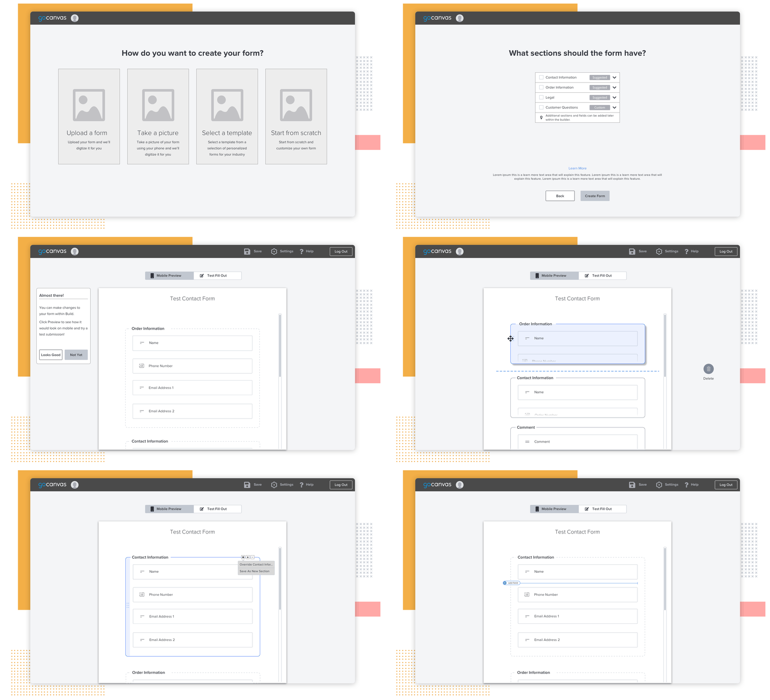
The team pitched an experience that learns the user’s problems, wants and needs, and then gives a solution we believe to be the best solution to their problems. This eventually ended up break up into two projects; Revamped Onboarding and Form Builder 3.0.
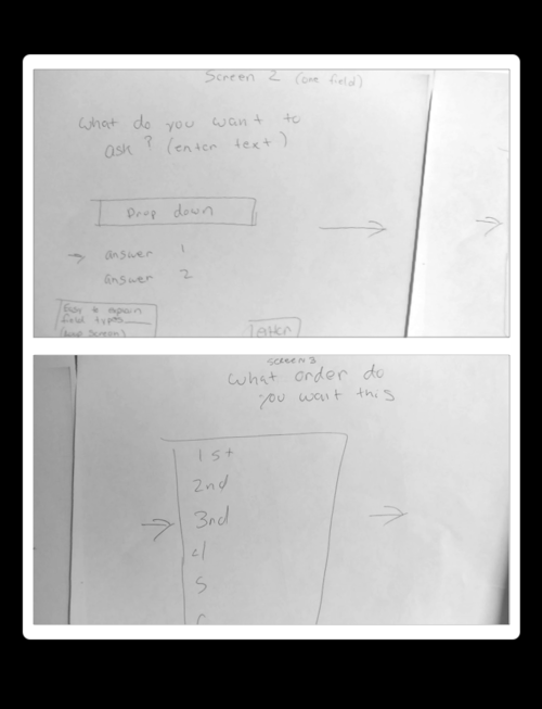
With a revamped onboarding, we would take the opportunity to utilize a set of onboarding questions that would eventually give us enough information to create a start point for you when you land into the new builder.
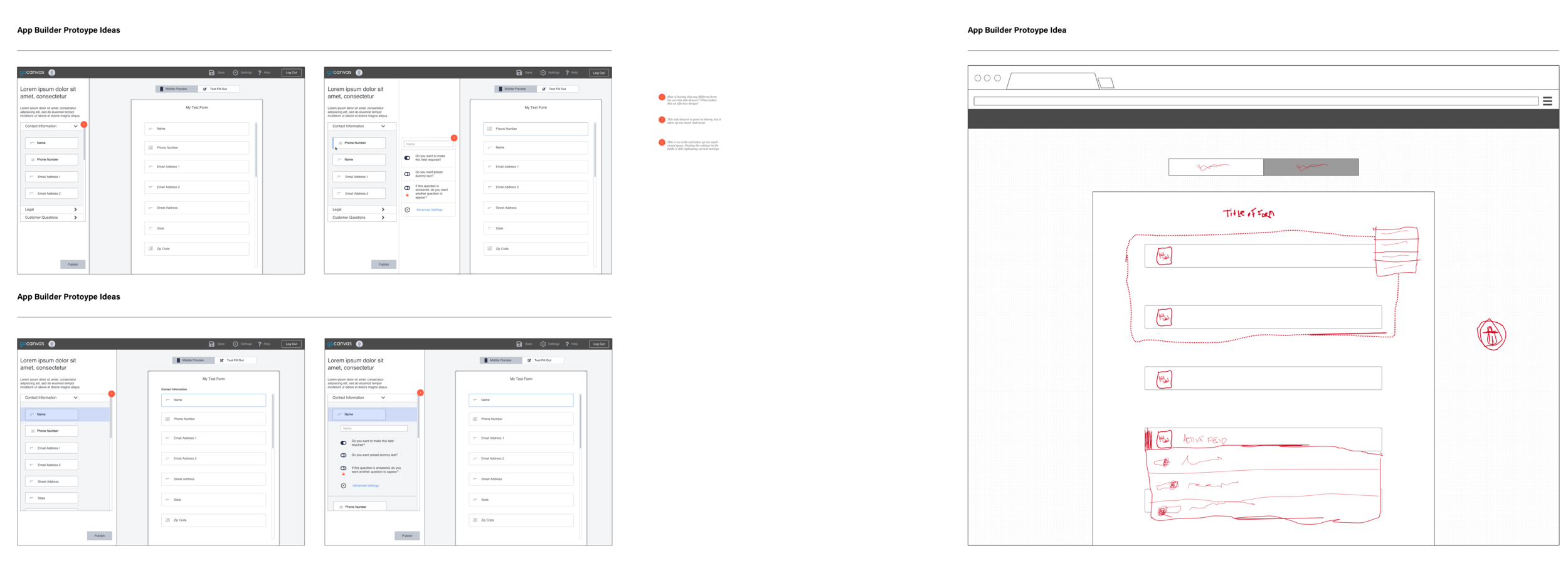
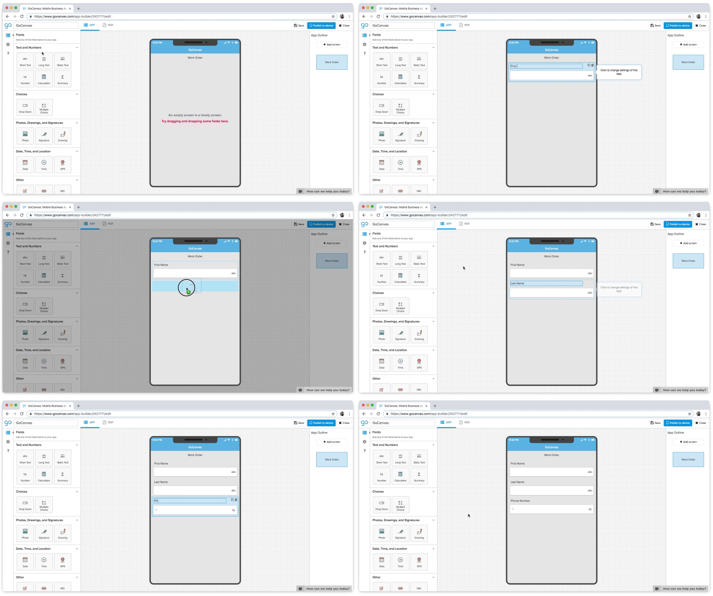
WIREFRAMES
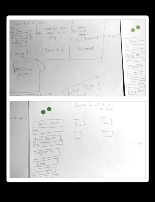
We went through a number of iterations over the life span of this project. Here are some of those ideas.
WHERE WE ARE NOW
After over a year of heads-down work and the impact of COVID-19 pandemic, we are set to launch the MVP April 2021.
Some highlights of the MVP:
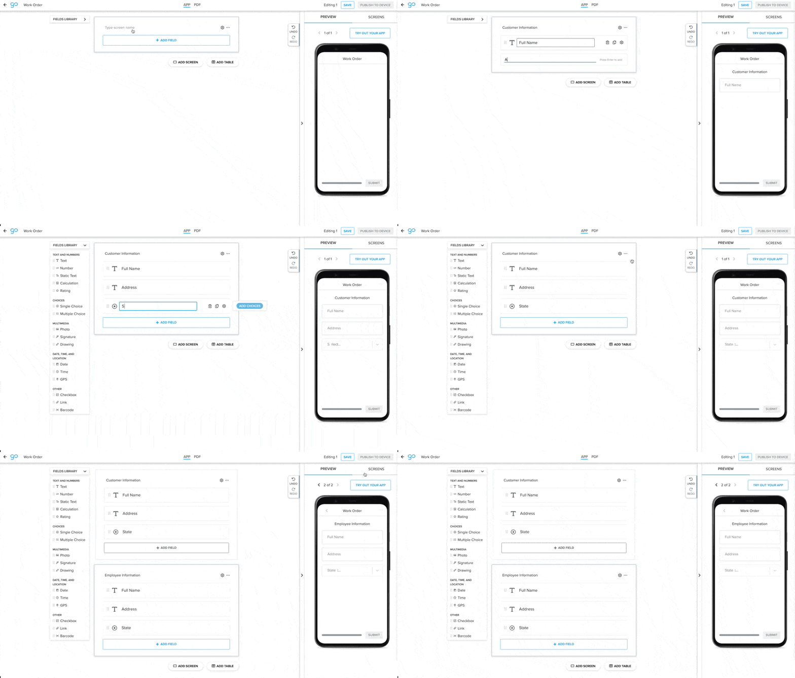
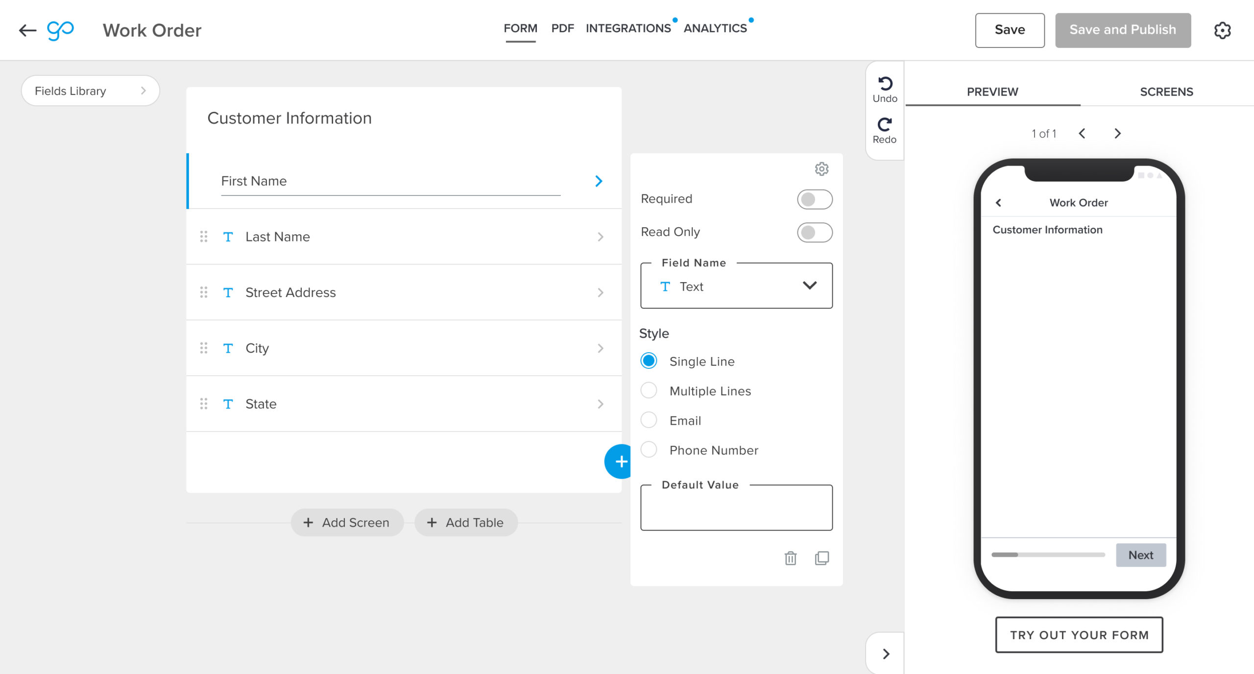
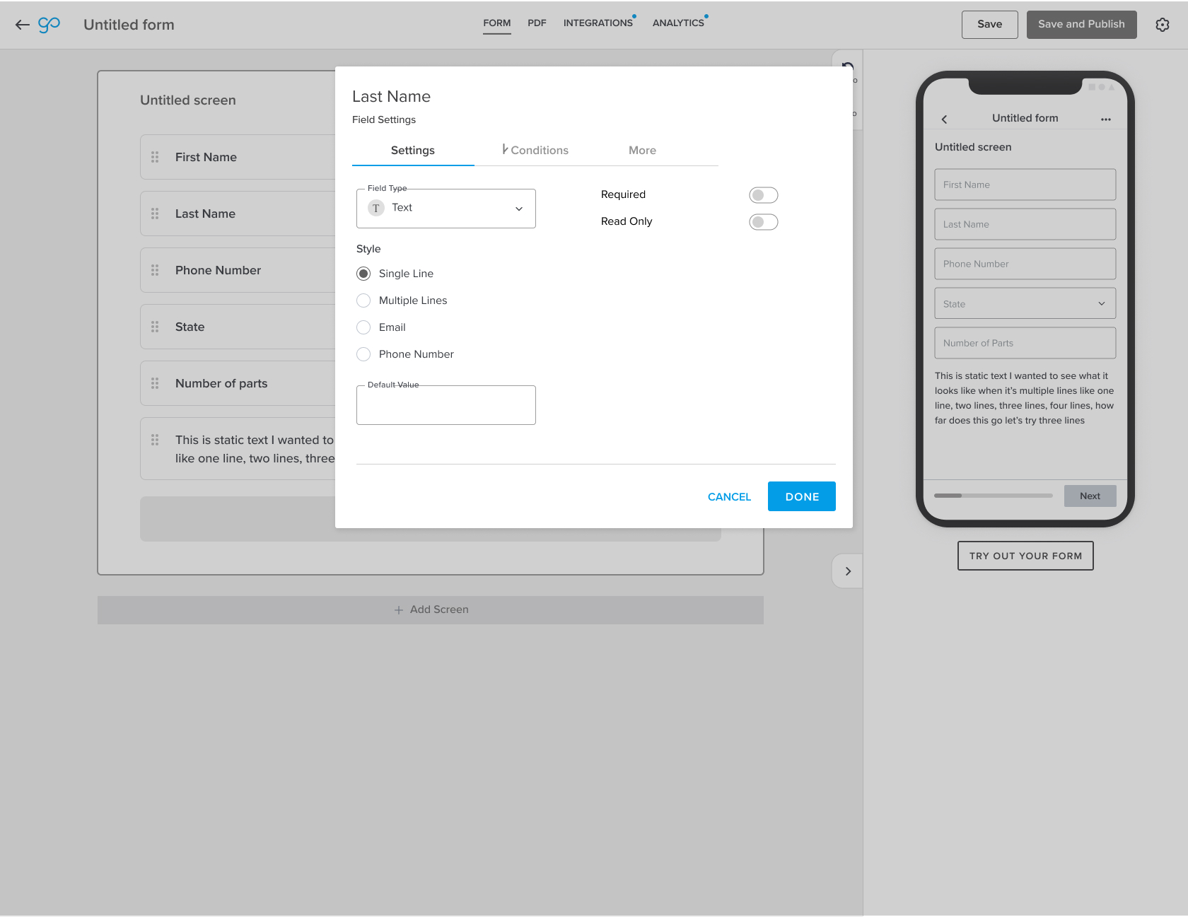
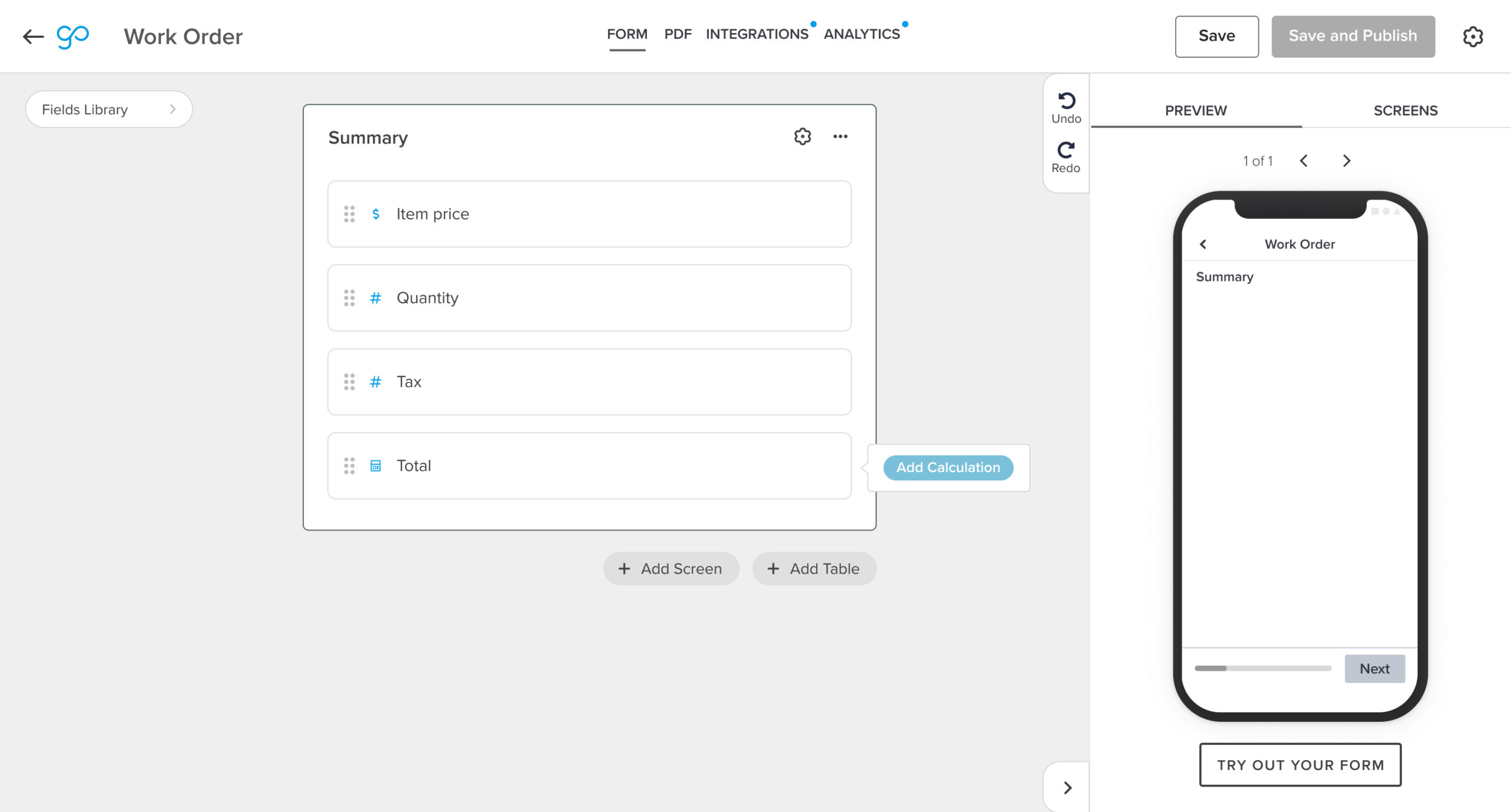
- We’ve designed it to work for power users and non-power users. Leveraging a fixed Fields Library, we allow power users to quickly access the historical way of building a form.
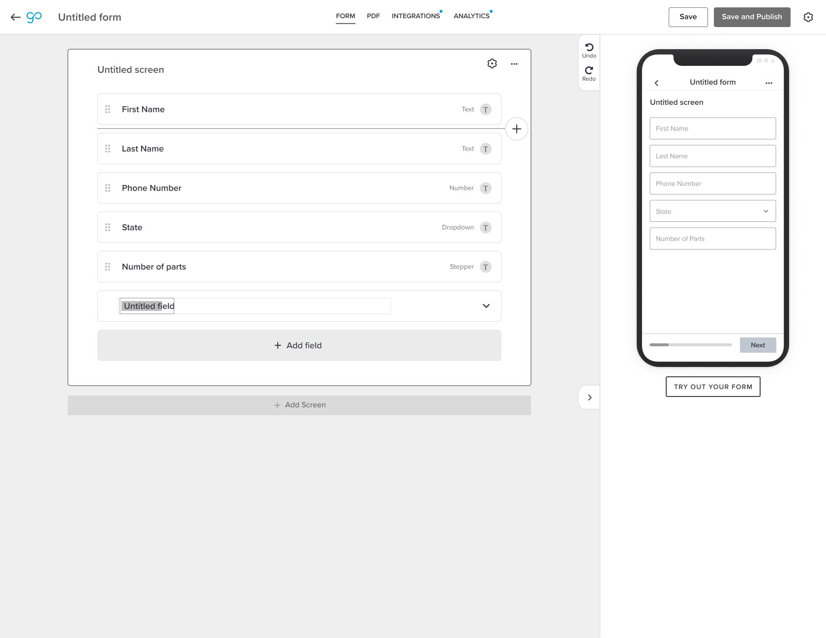
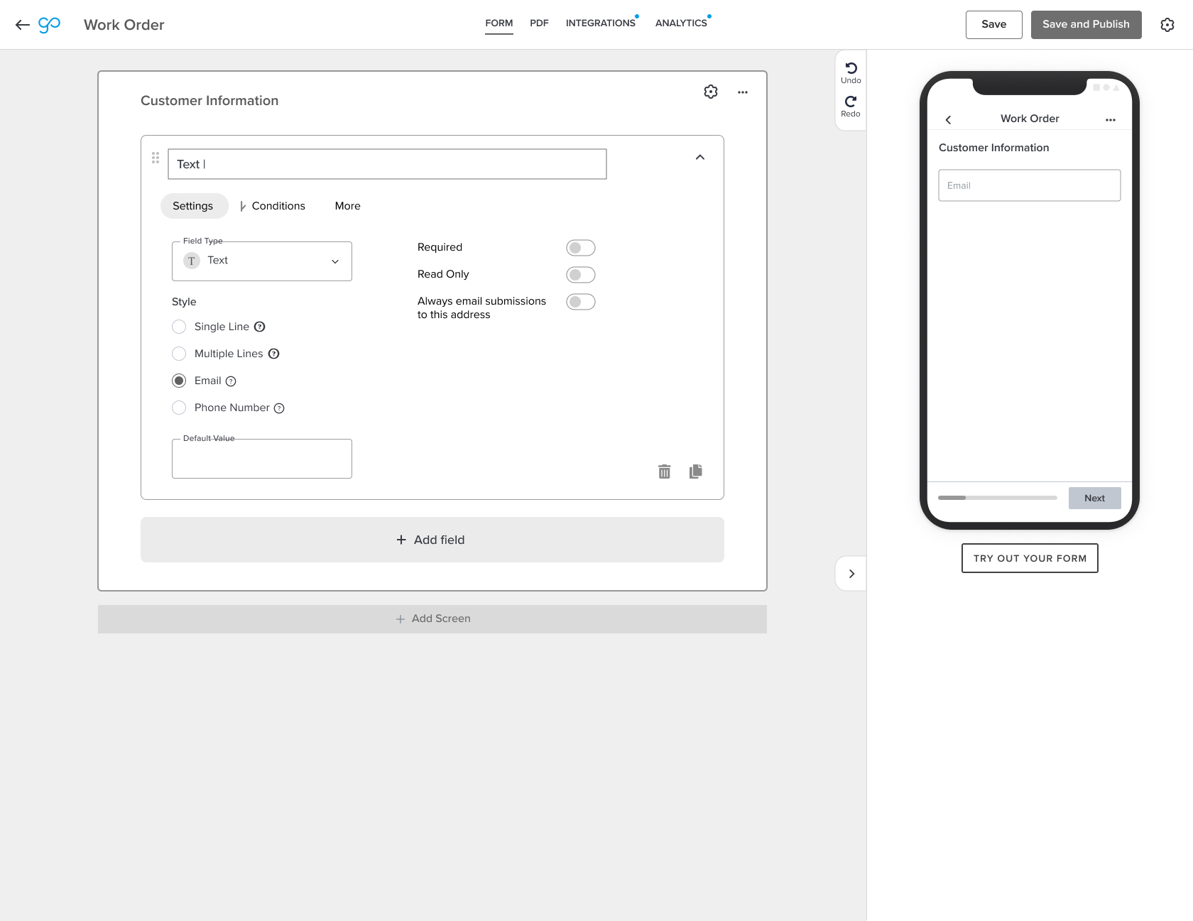
- For non-power users, we’ve shifted the mental model to focus on field names rather than field types. We now predict the field type for the field name customers type in, reducing the level of effort.
- Introduced a preview of the form along with allowing customers to do a test submission. This is a one of the biggest enhancements considering many of our customers would drop off at this point because they would need a physically mobile device to do a test submission. This also reduces the cognitive load for the user as it shortens the time from no form to a fully built form.
Check out the preview of the new form builder below!
